

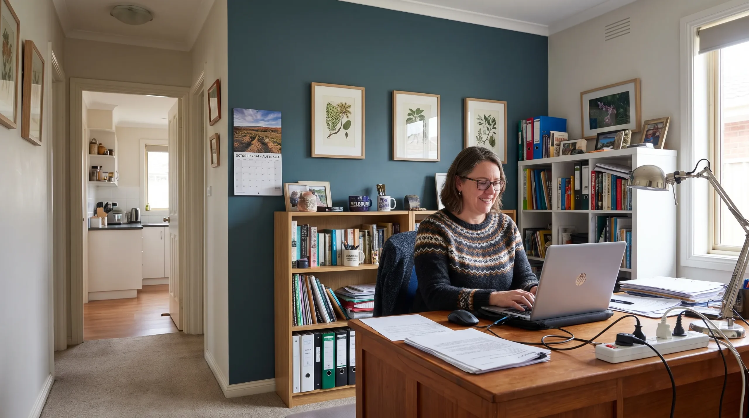

A thoughtful residential painting project can refresh your home without changing its layout or replacing every piece of furniture. The key is to give each room a clear purpose while keeping the colours, ceilings and woodwork connected. A welcoming living room might suit a soft neutral, while a bedroom can carry a deeper shade and a busy hallway needs a finish that tolerates regular cleaning.
These room-by-room ideas will help you choose where to add colour, where to keep things simple and how to create a cohesive Melbourne home.
How to plan residential painting room by room
Before choosing colours, walk through your home and note what will stay: flooring, cabinetry, benchtops, tiles and larger furniture. Paint should work with those fixed elements rather than compete with them.
Choose a small family of colours instead of selecting every room independently. A useful starting point is a main neutral for connecting spaces, one or two supporting colours and a consistent treatment for doors and skirting boards. Those supporting colours can appear on a whole room, a single wall or a smaller architectural detail.
Light matters too. North-facing Melbourne rooms often receive stronger daylight, while south-facing rooms may feel cooler. Test sizeable samples on more than one wall and view them in daylight and under your evening lighting. A colour that looks balanced beside a window can feel quite different in a shaded corner.
If you need help narrowing the palette, these paint colour ideas for homes offer a useful starting point. For residential painting that feels connected, repeat an undertone or trim colour rather than making every room identical.
Living room: use colour to organise the space
Frame a fireplace, shelving or seating area
A living room usually contains several competing elements, including sofas, artwork, windows and sometimes a television. Choose the feature you want to emphasise before deciding where a stronger colour belongs.
Painting a fireplace surround or the wall behind built-in shelving can give the room a focal point without adding another object. Muted olive, smoky blue or warm clay can work well when those tones already appear in rugs or upholstery. Check the suitability of any coating near a heat source before painting.
For a quieter result, use the same colour on walls and suitable joinery, with finishes selected for each surface. This reduces visual interruptions and lets textures such as timber, linen and leather stand out.
In an open-plan space, avoid placing a feature colour on an arbitrary wall. Use architectural boundaries, such as an alcove or change in wall direction, to make the transition look deliberate. Successful residential painting follows the shape of the room rather than treating every blank surface as an opportunity for contrast.
Kitchen and dining room: work with the existing materials
Kitchen colours need to sit comfortably beside cabinetry, splashbacks and benchtops. If those materials already contain strong patterns, a restrained wall colour can make the space feel less busy.
With warm timber cupboards, try a creamy white, muted green or light taupe. For cool grey cabinetry, compare neutral samples carefully so the walls do not introduce an unwanted pink or yellow cast. These are starting combinations, not substitutes for testing colours in your own kitchen.
The dining area offers more room for personality. A deeper wall behind the table can distinguish it from an adjoining living space without building a partition. Carry that shade into a small accessory elsewhere to keep the rooms connected.
Treat cabinetry as a separate painting task. Cupboard doors need a coating system suited to their substrate and use, not ordinary wall paint. If cabinets are sound but dated, ask whether repainting is suitable and what preparation the existing finish requires. For kitchen walls, prioritise a washable product appropriate for the surface and conditions.
Bedrooms: choose between softness and depth
A bedroom does not have to be pale to feel restful. Soft blue, dusty green, warm beige and muted rose can all work, depending on the light and furnishings.
For an understated scheme, keep the walls light and introduce a deeper colour behind the bed. Position the colour around the room's actual focal point, rather than automatically choosing the wall opposite the doorway.
If you prefer an enveloping look, consider painting all the walls in a mid-tone shade. Pair it with bedding that provides enough contrast for the room to feel layered rather than flat. Residential painting in bedrooms works best when the colour supports the furniture and lighting you already enjoy.
Give children's rooms a scheme that can grow
A painted half-height band adds interest without committing to a detailed mural. Use a simple horizontal line and choose colours that will still work when bedding and interests change.
Keep the more neutral shade across most of the room, then introduce stronger colour around a reading corner or behind shelving. Specify a washable finish suited to the walls. If choosing a low-VOC product, still follow the manufacturer's ventilation, drying and curing instructions before returning the room to normal use.
Bathrooms: refresh the walls without hiding problems
In bathrooms, start with the tiles and fixtures. Warm white can soften a room with beige stone, while a muted blue-green can complement white tiles and timber details. Where the tile pattern is busy, a single quiet wall colour usually creates a clearer overall scheme.
Painted ceilings also deserve attention. A fresh, light ceiling can improve the appearance of a bathroom even when the tiles and vanity remain unchanged.
Before residential painting begins in a bathroom, investigate peeling coatings, water stains and recurring mould. Painting over them does not fix leaks, persistent condensation or inadequate ventilation. Use a coating specified for the conditions, but do not treat moisture-resistant paint as waterproofing or a substitute for required wet-area construction.
If painting forms part of a larger renovation, Tap Tech's step-by-step bathroom renovation planning guide provides useful prompts for assessing the existing room and sequencing plumbing, fixtures and finishes. Its local advice concerns Kingston, Canada, so confirm permit, licensing and wet-area requirements with the relevant Victorian authorities and trades.
Entry and hallway: make connecting spaces feel intentional
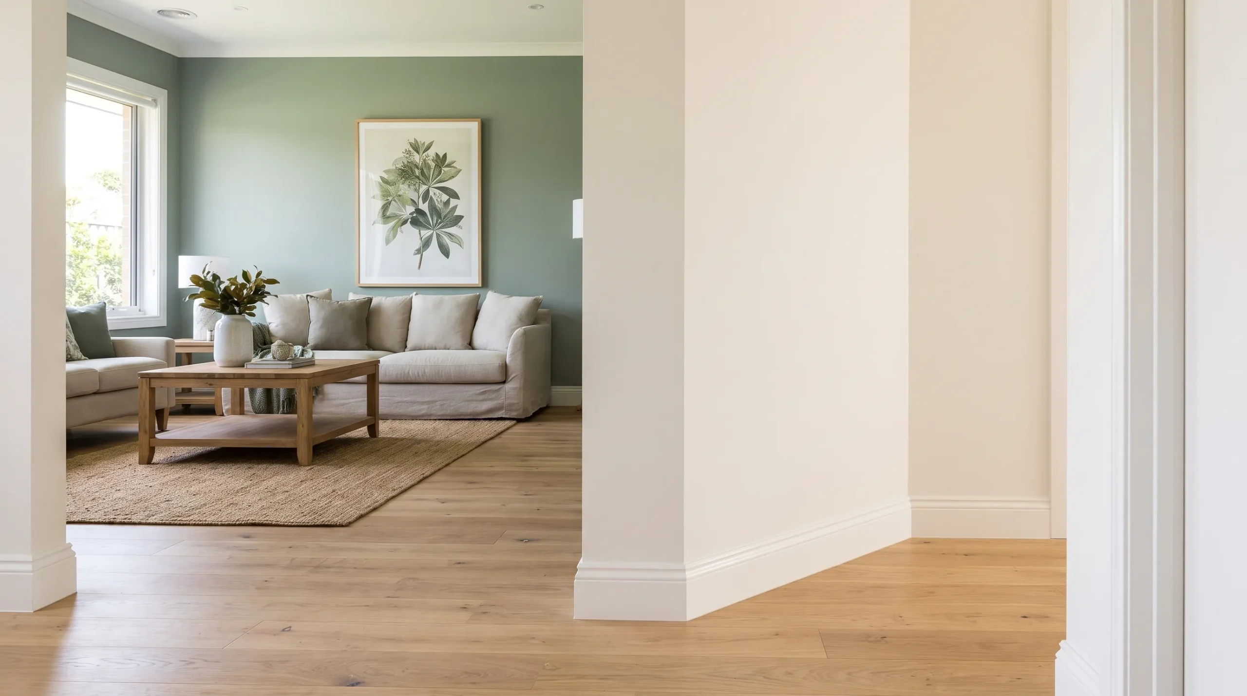
Hallways connect the rooms, so they are a useful place to repeat your main neutral and trim colour. This gives the eye a consistent reference as it moves through the home.
For a narrow entry, try light walls with a slightly deeper colour on the front door's interior face. The contrast adds interest without making every wall visually prominent. In a larger entrance, a muted colour across the walls can create a welcoming transition from outside.
A half-height painted band can also work in a family hallway, especially when it relates to existing panelling or another architectural line. It is a design choice rather than automatic protection against scuffs, so the paint's washability still matters.
For residential painting in these high-traffic areas, give doors, frames and skirting boards as much attention as the walls. Worn woodwork can make an otherwise fresh scheme look unfinished.
Home office and laundry: tailor the colour to the task
Keep the office backdrop simple
Choose an office colour that works with your desk, storage and lighting. Muted green, warm grey or soft blue can provide a subdued background without making the room feel stark.
If the office also serves as a guest room, repeat a bedroom colour from elsewhere in the home. A deeper shade behind the desk can define the work area while the remaining walls stay lighter. For video calls, consider what will actually appear behind you before choosing a feature wall.
Give the laundry a deliberate finish
Laundry rooms often receive leftover colour decisions, yet a clear palette can make them feel more considered. Try warm white walls with a muted blue or green door, or repeat the kitchen wall colour to connect the utility spaces.
Check for moisture problems before repainting and choose products suited to the surfaces and conditions. Around sinks and frequently cleaned areas, durability matters more than a fashionable colour name.
Ceilings and trim: choose the details that connect each room
You do not need a different decorative treatment everywhere. Pick one approach for most of the home, then make exceptions where the architecture supports them.
| Approach | Wall treatment | Ceiling and trim idea | Where to consider it |
|---|---|---|---|
| Quiet continuity | Related neutral shades | Consistent light ceiling and trim colours | Open-plan areas and hallways |
| Defined feature | One stronger wall or alcove | Keep surrounding surfaces restrained | Living rooms and dining areas |
| Enveloping colour | One hue across the walls | Consider matching trim in a suitable coating | Bedrooms and home offices |
A ceiling does not always need to be bright white. A softer white may work better with warm walls, while a coloured ceiling can suit a room where you want a more enclosed feeling. Test it carefully, because an overhead colour changes the room's overall balance.
The finishing choices in residential painting should also reflect how surfaces are used: walls, ceilings and doors may need different products even when their colours match.
Frequently asked questions
Should every room be painted the same colour? No. A shared neutral or consistent trim colour can connect different room colours. Repeating undertones helps the scheme feel deliberate without removing each room's character.
Can dark paint work in a small room? Yes. Darker colours can create a cosy, enclosed effect, but they will not automatically make a room feel larger. Test samples with your lighting and consider the contrast created by ceilings, curtains and furniture.
Is painting one feature wall enough to refresh a room? Sometimes, especially when the surrounding paint is in good condition. Check for fading, marks and worn trim first. A new feature wall can make existing wear more noticeable.
How should I compare painting quotes? Compare the surfaces included, preparation, coating system and exclusions, not just the total price. This guide to what residential painting contractors include in their quotes explains what to check before approving the work.
Plan your home's refresh with Auspainters
Start with the rooms that need the most attention, then choose a palette that connects them to the rest of your home. Bring your samples, photos and priorities to the quoting stage so the scope is clear.
Auspainters provides interior and exterior painting across Melbourne, with free quotations, premium finishes and a 5-year workmanship warranty. The team is Dulux accredited, fully insured and OHS compliant, with a final walkthrough included.
Request a free quote from Auspainters to discuss your room-by-room refresh and the finishes suited to your home.