

Your premises communicate something about your business before anyone speaks to your team. Thoughtful commercial painting helps make that message consistent with the brand you want customers to recognise, whether that means careful and professional, warm and approachable or bold and creative.
For Melbourne businesses, this is about more than choosing an attractive colour. The condition of your entrance, the finish around your reception desk and the way your signage sits against a wall all contribute to the experience. A well-planned repaint brings those details together without turning every surface into an advertisement.
What your premises say before you say a word
A faded entrance or heavily scuffed reception wall can create a mismatch between your marketing and the experience of visiting your business. That does not mean customers will automatically distrust you, but it gives them a detail that conflicts with an otherwise professional presentation.
The reverse matters too. Clean, consistent surfaces provide a setting in which your products, people and service can stand out. A restrained accounting office and a colourful retail store can both look professional when their presentation suits their audience.
The aim is alignment, not decoration for its own sake. Start with the qualities your business wants to communicate, then assess whether the physical space supports them.
How commercial painting translates brand values into a space
A useful commercial painting brief starts with three or four brand attributes rather than a paint chart. Words such as “precise”, “welcoming” or “energetic” give the project a direction, provided you translate them into practical decisions.
The following examples are design starting points, not rules about how particular colours make everyone feel.
| Brand quality | Possible painting approach | Detail to check |
|---|---|---|
| Precise and professional | A restrained palette with consistent trim and carefully defined edges | Visible repairs, uneven coverage and untidy junctions |
| Warm and approachable | Muted colours that work with timber, upholstery and existing lighting | Whether the room feels welcoming under its actual lights |
| Creative and expressive | A deliberate feature colour balanced by quieter surrounding surfaces | Whether displays and signage remain easy to distinguish |
| Established and dependable | A cohesive scheme across the frontage, reception and meeting areas | Whether older and newer parts of the premises look connected |
Bring photographs of your premises, brand guidelines and examples of spaces you like to the initial discussion. These give a painter more useful context than a colour name alone.
Choose colours for the building, not just the logo
Your logo colour may work beautifully on a website but become overpowering across a large wall. Printed colours, digital colours and paint finishes also use different reproduction methods, so a screen reference is not a reliable final specification.
For commercial painting, treat brand colours as part of a broader palette. A strong corporate blue might suit a reception feature wall or selected architectural detail, with quieter colours supporting the rest of the space.
Test sizeable samples on the actual surfaces before approving the scheme. Check them in daylight and under the lighting customers will encounter. Consider nearby flooring, joinery, furniture and signage because these affect how the colour looks in context.
For businesses with several locations, record the approved colour references, coating products, sheen levels and application locations. This creates a repeatable standard while allowing for differences between buildings.
Avoid relying on claims such as “blue builds trust” or “red increases sales”. Colour associations vary, and a successful scheme needs to suit your audience, premises and overall identity rather than follow a universal formula.
Prioritise the places customers actually notice
A brand-focused refresh does not necessarily require repainting every room at once. Walk through the premises as a first-time visitor and identify where the building introduces, reinforces or weakens your intended image.
Start with arrival and reception
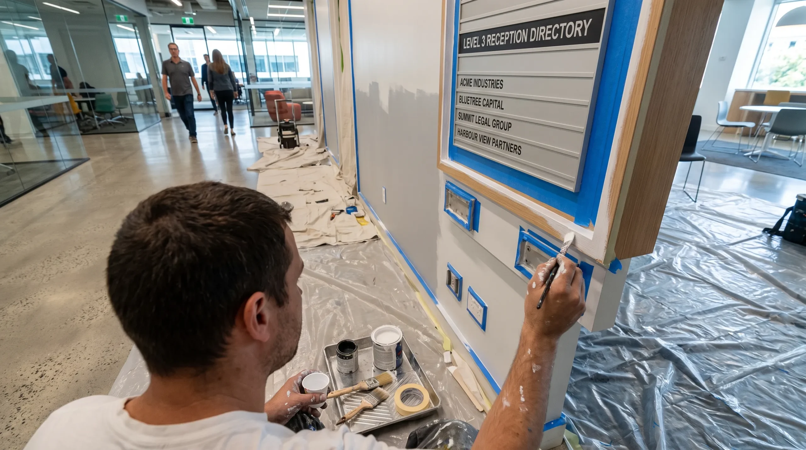
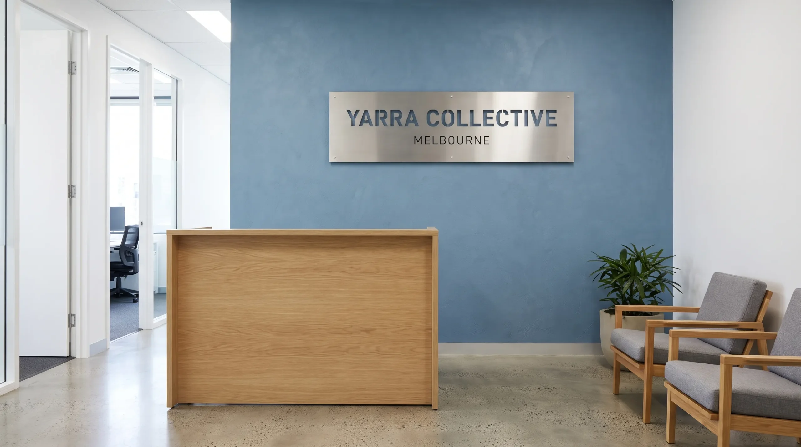
Look at the frontage, entry door, surrounding trim and the wall behind your reception point. Check whether the business name is clearly distinguishable from its background and whether worn surfaces distract from it.
Targeted commercial painting can be useful when the budget is limited: refreshing a visibly tired entrance may address a clearer presentation problem than repainting a rarely used back office.
Follow the customer journey
Continue through waiting areas, consultation rooms, meeting spaces and customer amenities. An immaculate reception followed by a neglected corridor creates an inconsistent experience.
Photograph each area and record what needs attention. Separate paint-related issues from damaged signage, poor lighting or clutter. Painting can improve the background, but it cannot resolve every presentation problem. This distinction helps you direct spending towards the changes that matter most.
Let finish quality support the brand promise
Colour establishes the direction, but preparation and application determine whether the result looks considered. Uneven patching, paint on adjoining fittings and inconsistent sheen can undermine an otherwise suitable scheme.
Ask how the contractor will assess existing surfaces, address defects and select compatible primers and topcoats. Moisture problems, unstable coatings or damaged substrates need investigation rather than being hidden beneath fresh paint.
Finish selection also needs to suit the location. A frequently cleaned corridor has different demands from a decorative wall behind reception. Higher-sheen coatings can make surface imperfections more noticeable, so the choice involves appearance as well as maintenance.
The lasting brand benefit of commercial painting depends partly on how well the finish holds up to ordinary use. A scheme that looks polished at handover but is difficult to maintain may soon lose its consistency.
For more detail on specifying work for occupied interiors, Auspainters’ guide to commercial interior painting for productive workspaces explores practical considerations beyond the colour palette.
Protect the customer experience during the refresh
The painting process should support your brand standards too. Customers should not have to navigate unclear access routes, unprotected work areas or unexpected closures without notice.
Agree on work zones, communication responsibilities and handover requirements before the project starts. Ask about odour, ventilation, drying and curing requirements for the specified products, rather than assuming a freshly painted area is immediately ready for normal use.
Planning advice, execution, quality checks and clean-up as one process is useful beyond the local market. Jackson & Jackson’s approach to painting business premises in Denmark describes these connected stages and the need to account for business operations and deadlines.
For your Melbourne premises, confirm what arrangements are actually included in the quote. Do not assume after-hours work or a particular completion window is available. Auspainters’ guide to minimising business downtime during painting explains the planning questions worth raising.
A commercial painting schedule should be realistic about access, preparation and product requirements, not simply fitted around an opening date without checking feasibility.
Check whether the result delivers a consistent image
Judge the completed project against the original brand brief, not just whether the new colour looks appealing. Revisit the qualities you identified at the start and walk the same customer route again.
Compare before-and-after photographs taken from similar positions and under similar lighting. Check the finish around signage, doors, fittings and transitions between painted surfaces. Record any defects or incomplete items during the final walkthrough.
You can also ask customer-facing staff whether visitors have difficulty identifying the entrance or finding key areas. Treat that feedback as practical information, not proof that paint alone changed customer behaviour.
There is no universal sales uplift to promise from commercial painting. More useful measures include consistent presentation, fewer visible surface defects and a clear maintenance plan that keeps the premises looking cared for.
Frequently asked questions
Should every wall match our brand colours? No. Use recognisable colours selectively and coordinate them with supporting tones. This usually gives signage, products and furnishings more room to stand out than repeating a strong logo colour throughout the premises.
What is the difference between commercial and residential painting? Commercial projects often need to accommodate customer access, workplace safety, business operations and higher-use surfaces. Many preparation principles are shared, but the site requirements and coating specifications can differ substantially.
What do commercial painters charge per square metre? There is no reliable single rate for every project. Surface condition, preparation, access, coating specifications and scheduling all affect the price. Ask for a site-specific quote with a defined scope rather than comparing square-metre figures alone.
How often should a business repaint? Base the decision on condition and presentation rather than a fixed interval. Inspect high-contact areas regularly and consider a broader refresh when coatings deteriorate, the brand changes or the premises no longer present consistently.
Will repainting increase sales? It may improve the setting in which customers experience your business, but it cannot guarantee additional sales. Service, product quality, pricing and location remain separate influences.
Give your brand a more consistent physical presence
A successful commercial painting project connects brand identity with practical choices about colour, preparation, finish quality and ongoing care.
Auspainters provides interior, exterior and commercial painting across Melbourne, with free quotations and a 5-year workmanship warranty. The team is Dulux accredited, fully insured and OHS compliant, with a final walkthrough included.
To plan a refresh around your premises and brand goals, request a free quote from Auspainters. Bring your brand references and the areas you want to improve so the discussion starts with a clear brief.